Visualizing the Central Line Like Never Before
As someone who loves blending data with design, I recently experimented with creating a 45° top-down isometric miniature 3D scene of the London Underground's Central Line. The goal was to present live transit information in a visually compelling way that’s easy to grasp at a glance.
Starting with a clean, soft white tile background, I placed the title "CENTRAL LINE" right at the top center in bold sans-serif text. Just below it, I added a subtle train icon to anchor the theme, followed by the words "Service Status" in smaller text, and then the current status in medium-sized red text to catch attention immediately.
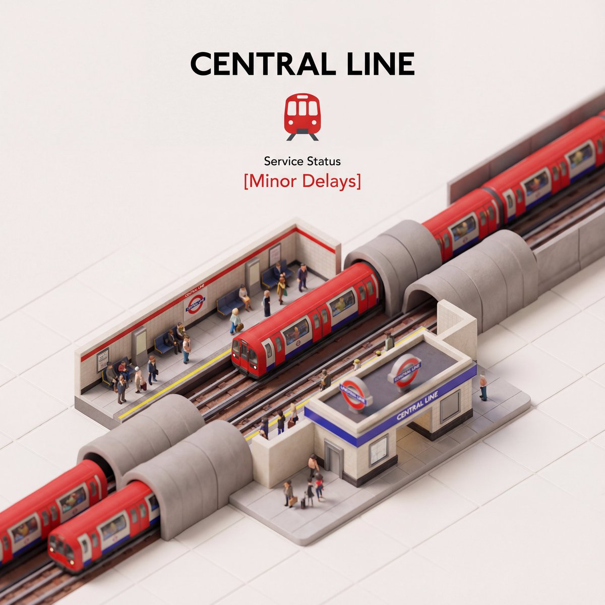
This layout makes the otherwise mundane transit update feel like a mini artwork while still delivering critical information clearly. Because the Central Line's service can change frequently, incorporating the live status dynamically is key—I pulled the current status from a live search to keep the scene up-to-date.
One of the best discoveries during this process was how much the isometric angle adds depth without complicating readability. It’s a sweet spot between flat 2D and fully 3D, making it perfect for embedding in apps, websites, or digital signage.
For anyone looking to replicate or build on this, a few tips: keep the text hierarchy strong so viewers know where to look first, use color strategically (like red for alerts), and maintain a clean background to avoid distractions. Also, adapt the prompt to pull in other live transit details—imagine adding next train times or platform changes!
You can find the full prompt here: ✨Prompt✨
Using AI for image generation like this opens exciting doors to fresh, engaging transit visuals. Whether you’re a content creator, app designer, or just a transit fan, this approach makes service updates feel less like boring status lines and more like dynamic, informative art.