Discovering the Power of Color Blocks in Product Photography
When I first experimented with color block product photography using FLUX.2 in @AdobeFirefly, I wasn’t sure how the bold, flat color zones would complement my product shots. The idea was simple: place the product within a vivid, graphic environment featuring hard edges and contrasting or complementary colors. But the results blew me away.
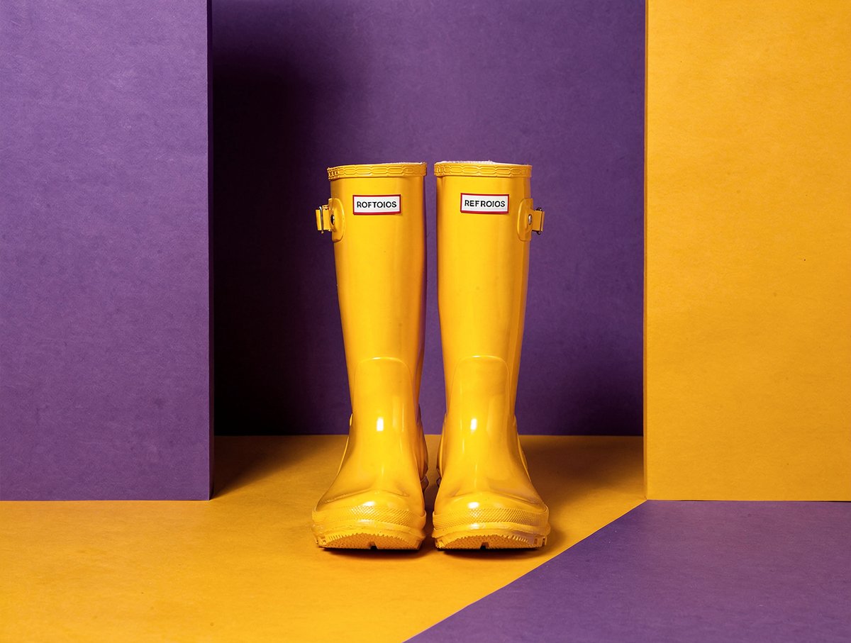

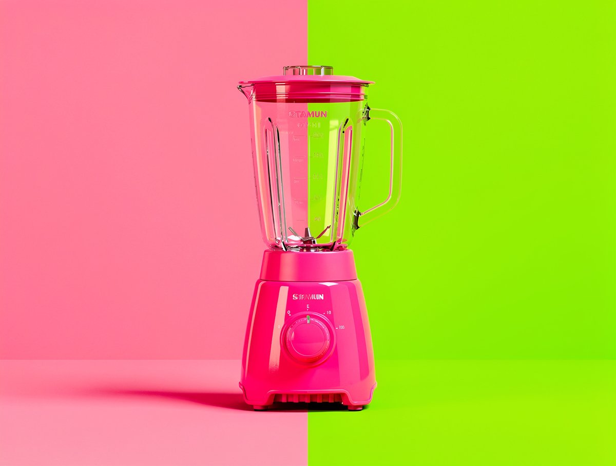

The clean separation between color zones creates a visual tension that feels both editorial and playful. It’s reminiscent of pop art, with its striking simplicity and vibrant hues. The flat lighting emphasizes the graphic design influence, making the product the unmistakable star without distractions.
What I loved most was how this approach transformed ordinary product photos into bold statements. The use of complementary or contrasting color schemes makes the product pop in a way traditional studio setups rarely achieve. It’s minimal yet powerful.
Practical Insights from My Color Block Photography Journey
- Hard edges matter: Crisp delineation between colors enhances the composition’s graphic feel.
- Color choice is key: Complementary colors bring balance, while contrasting hues add energy.
- Flat lighting works best: It prevents unwanted shadows and keeps attention on the product and colors.
- Keep it simple: Striking simplicity is what gives this style its editorial edge.
For anyone diving into AI image generation or looking to refine their editorial product photography, experimenting with color blocks using tools like FLUX.2 in Adobe Firefly is a game changer. It’s a fresh way to make products visually memorable and shareable.
You can find the full prompt here: ✨Prompt✨
Explore more on text to image and how to use prompt adjustments to perfect your shots. Whether you’re a beginner or an experienced creator, this style offers endless possibilities to elevate your visuals with AI art creator tools.