Discovering the Charm of Flat Design Illustration
As a creator constantly exploring new visual styles, I recently experimented with flat design illustrations. The idea was to focus on simplicity and clarity, presenting subjects in a clean, front-facing style that feels both modern and approachable.
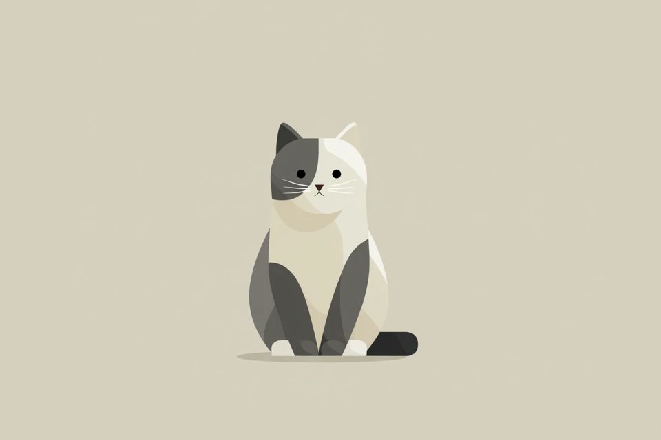
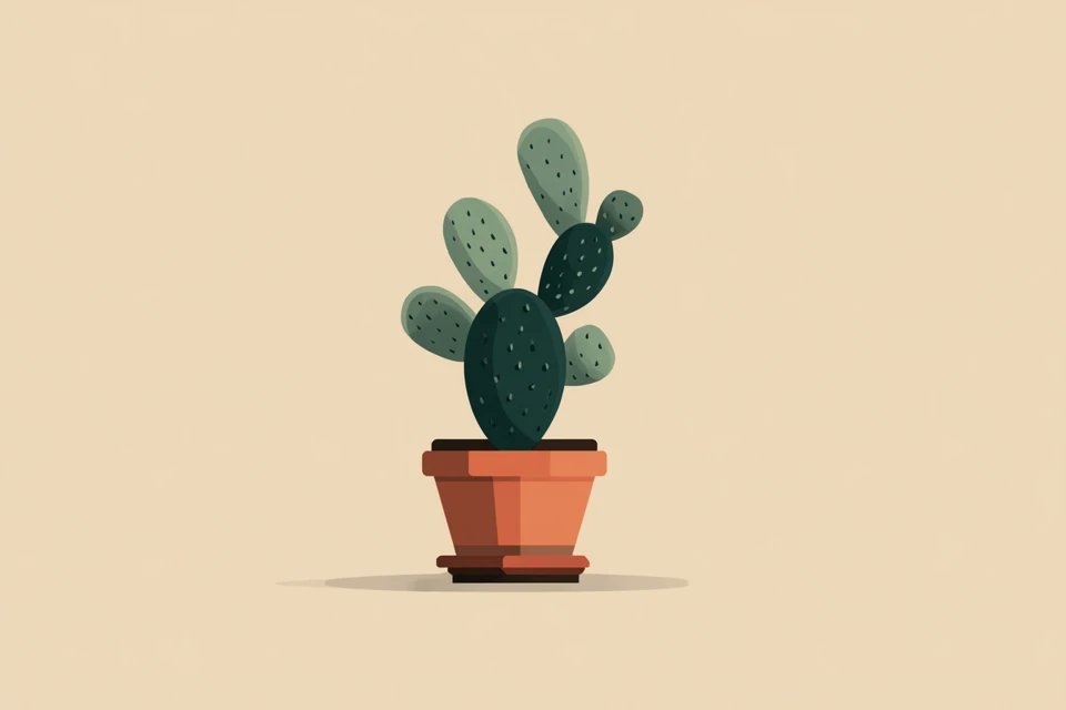
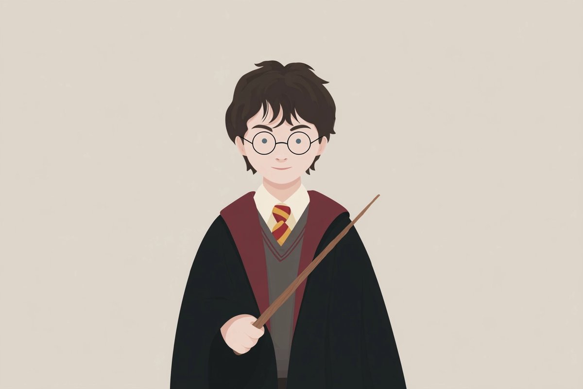
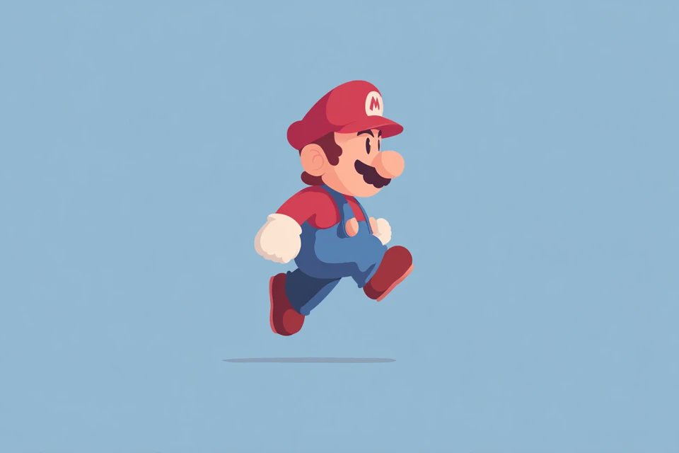
The flat design approach uses minimalistic shapes and a restrained color palette, often involving soft neutrals and gentle contrasts. In my case, I worked with a plain background color that allowed the subject to stand out without distractions, while two harmonious colors gave the illustration balance and warmth.
This style’s charm lies in its geometric simplicity and well-thought spacing, which creates a visual rhythm that’s easy on the eyes. It’s amazing how a few clean shapes can communicate so much personality and detail without overwhelming the viewer.
Why I Chose Flat Design
Before trying flat design, my visuals were often more complex, with gradients and textures that sometimes competed for attention. Switching to flat illustration helped me streamline my content, making it instantly more digestible for my audience.
Using a soft, neutral palette, especially with two main colors, added a cohesive and calming effect that fits well with my brand’s aesthetic. The minimalism also encourages thoughtful use of space, which enhances the overall balance.
Practical Insights From My Experience
- Color choice matters: Soft, neutral colors keep the design gentle and inviting.
- Balance your shapes: Clean geometric forms with balanced spacing avoid clutter.
- Keep backgrounds plain: A simple backdrop ensures the subject remains the focus.
- Front-facing perspective: This straightforward angle creates an immediate connection.
These insights helped me refine my prompts and avoid common mistakes like overcrowding the composition or using too many contrasting colors that disrupt harmony.
Where Flat Design Fits in My Creative Workflow
Flat illustration has become my go-to style when I want visuals that feel fresh yet timeless. It works particularly well for social media posts, infographics, and branding elements where clarity and friendliness are key.
When crafting AI prompts, I now emphasize minimalism and color harmony, ensuring that the generated images align with my vision. This approach also speeds up my workflow since the simplicity reduces the need for heavy post-editing.
You can find the full prompt here: ✨Prompt✨
For creators curious about how to start with flat design or looking to improve their AI image generator outputs, focusing on minimalism and balanced palettes is a reliable method. The style’s accessibility makes it a great entry point into text to image art creation, and it pairs well with other techniques that emphasize clean visuals.
Exploring flat design illustration has definitely enhanced my creative toolkit, and I recommend it to anyone aiming to produce clear, charming visuals without the fuss.
Learn more about image generation and how prompt adjustments can help you master this style.