Recently, I dove into crafting a super clean and modern infographic poster centered around a country’s identity. The goal was to merge premium editorial design with lifestyle travel photography vibes — think magazine-quality meets social media shareability.
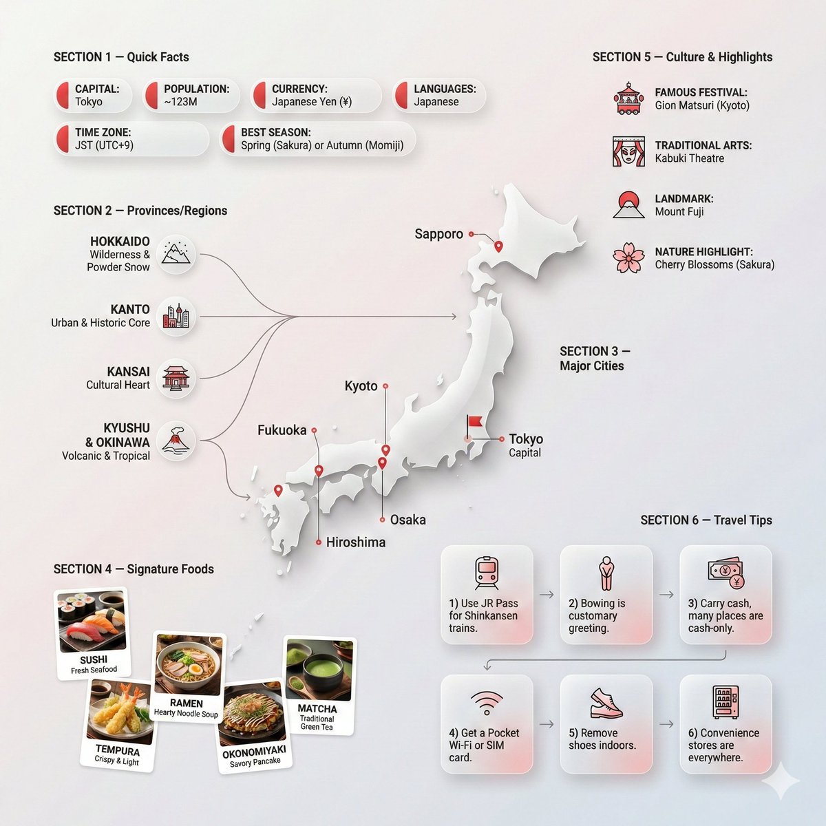
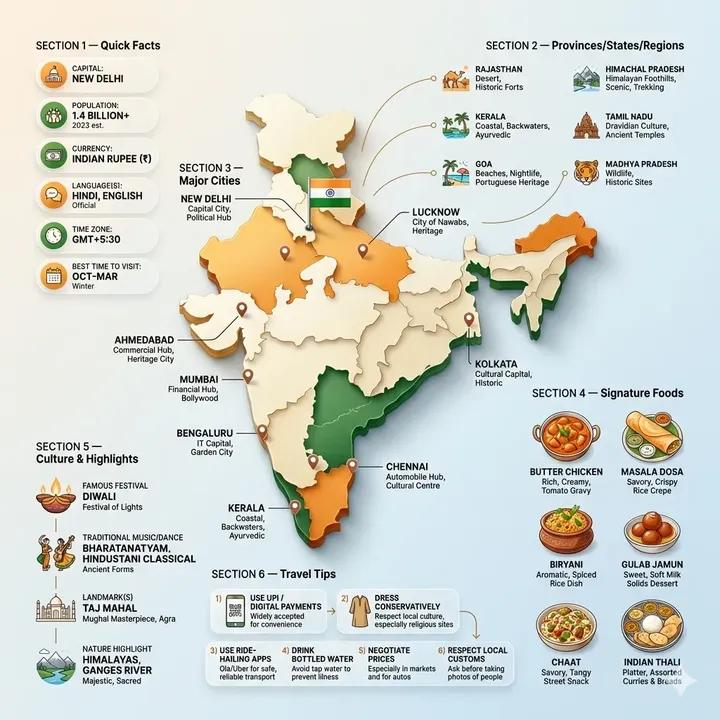
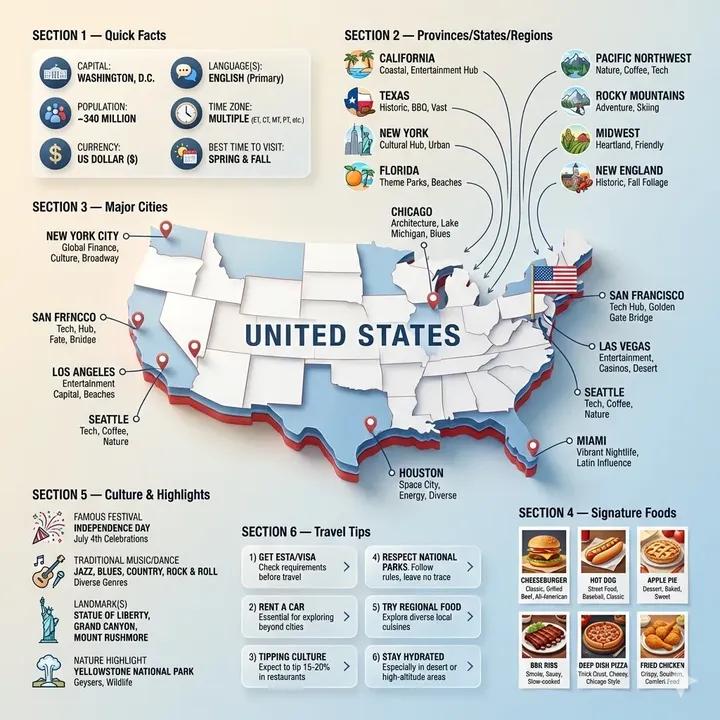
The hero of the poster is a slightly angled 3D map silhouette of the country, styled like glossy paper cutout with a delicate shadow that feels like natural studio lighting. This instantly adds depth and a tactile feel, making the map pop on a minimal gradient background with subtle texture. It’s all about that upscale, ultra-clean look.

You can find the full prompt here: ✨Prompt✨
Designing Around the Hero Map
Around this map, I arranged information like a recipe infographic — dynamic floating panels and clusters that break free from the usual grid. The hierarchy is clear: the map is the star, followed by quick facts badges styled as rounded glassmorphism bubbles with accent colors inspired by the country’s flag. These badges hold essentials like capital city, population, currency, and best travel season.
That visual separation helps the viewer absorb key info fast, without overwhelming the eye.
Infographic Ingredients: Regions, Cities, Foods & Culture
Next, I created ingredient-style clusters for provinces or regions, each with a simple icon—mountains, coastline, forests—that visually narrate the landscape’s diversity. Thin lines connect these clusters to the map, forming a natural flow.
Major cities are pinned with clean labels and subtle arrows, avoiding clutter while guiding the eye smoothly around the poster.
Signature foods get their own spotlight with vibrant mini illustrations, showing the country’s culinary highlights—whether spicy street food or sweet desserts—keeping colors natural and mouthwatering.
Culture and highlights are represented with crisp vector icons and concise notes, from famous festivals to iconic landmarks and nature spots, adding editorial flair without crowding the design.
Travel Tips with Style and Clarity
Finally, I arranged travel tips in numbered glassmorphism panels with soft gradients and gentle drop shadows, each paired with a small icon like a plane or camera to reinforce the message visually. This step-like flow around the map adds practical value and balances the composition.
What I Learned
Working on this project reinforced how crucial layered hierarchy and negative space are in text to image creation. The balance between editorial polish and lifestyle warmth makes the content feel both premium and inviting. Using accent colors thoughtfully—not overpowering—kept the design cohesive and true to the country’s identity.
For fellow creators, remember that subtle lighting and minimal texture backgrounds can elevate flat maps into engaging focal points. Also, floating info clusters with clear visual connections maintain flow and readability in busy layouts.
If you want to explore more about text to image techniques or try your own infographic posters, check out AI image generator tools and tips on image generation. It’s a game changer for creating crisp, editorial-style AI visuals.