Discovering Nano Banana Pro's Font Magic
As a creator constantly juggling visual styles, I was curious about Nano Banana Pro’s legendary font control. The claim? You can specify fonts not just sentence-wide but word-by-word—even character-by-character. Sounds like a designer’s dream, right? I decided to put this AI prompt to the test and see if it truly lives up to the hype.

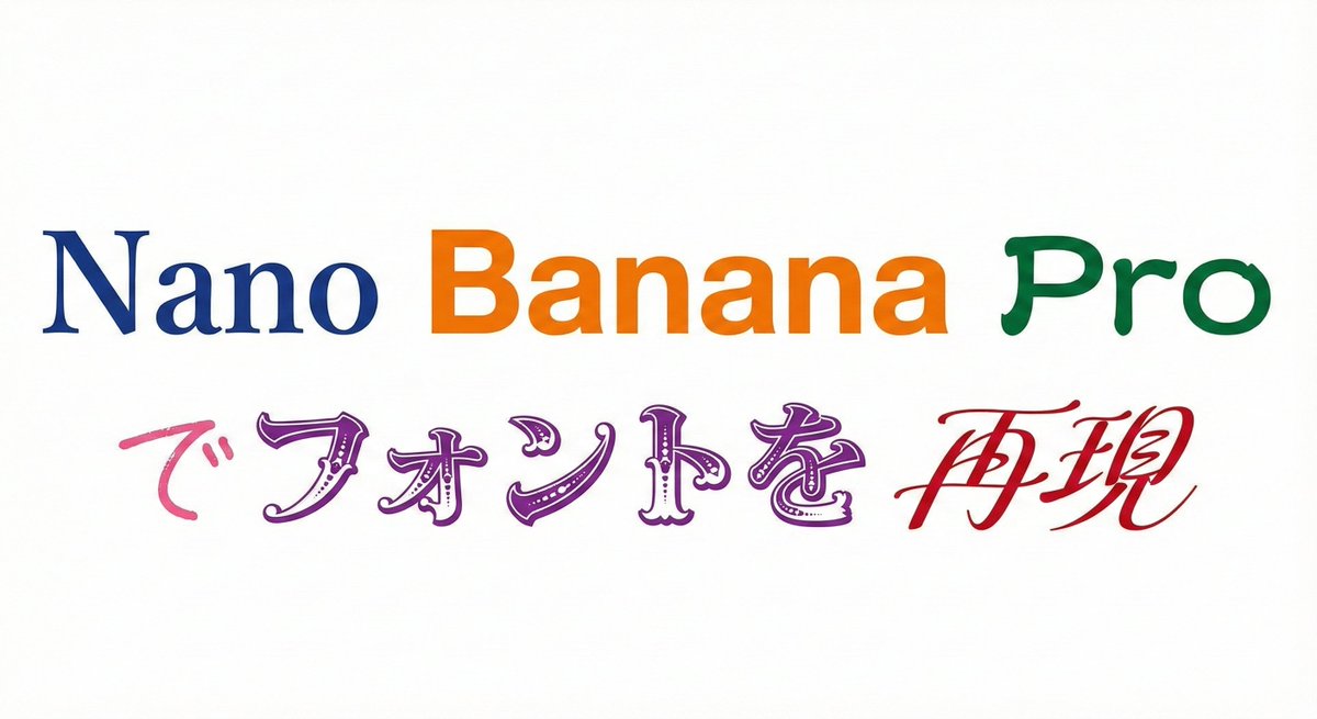
What blew me away was how seamlessly it handled nine distinct fonts in one go. From the elegance of 明朝体 (Mincho, a serif style) to the bold clarity of ゴシック体 (Gothic, sans-serif), and the traditional flair of 隷書体 (Reisho), the AI didn't just replicate fonts—it captured their unique personalities. I even saw 勘亭流 (Kanteiryu), a dramatic, thick brush style, and delicate 手書き風 (handwritten) strokes rendered beautifully.
One of the coolest parts was specifying fonts for individual words within the same text string. For example, Nano in 明朝体, Banana in ゴシック, and Pro in 隷書体. This level of control felt like moving from a random AI “gacha” to a serious, practical design tool. The black text on a white background made every font pop, and when I experimented with color changes per font, the results were vibrant and visually striking.
Why This Changes the Game
Before discovering this, mixing multiple font styles meant tedious manual work or limited design software capabilities. Nano Banana Pro’s prompt-driven approach lets me generate complex typographic compositions instantly, saving hours and opening new creative doors.
It’s especially handy for branding projects, social media visuals, and any content that needs to stand out with layered typography. The ability to tune each word’s font style, weight, and nuance through AI image generation is a total game-changer.
Of course, mastering the prompt structure took a few tries. Initially, I missed specifying background and text colors clearly, which led to muddled outputs. But once I refined the instructions—setting background to white and text to black or distinct colors per font—the results became reliably crisp.
Final Thoughts & Tips
- Be explicit with font names and styles in your prompt for best accuracy.
- Use color changes to highlight font differences visually.
- Test small sections of text before scaling up to longer content.
- Leverage this tool for branding, posters, or any project needing rich typography.
In short, Nano Banana Pro’s font control is no gimmick. It’s a powerful AI image generator feature that transforms how we approach text-to-image creation. If you want to experiment with layered fonts and unique typographic moods, this is the AI prompt to try.
You can find the full prompt here: ✨Prompt✨
Related resources: text to image, AI art creator, and image generation.