Recently, despite feeling like my posts were getting limited reach, I committed to daily content creation. One of my latest projects was inspired by the charming world of Animal Crossing, focusing on fruit trees. This time, I aimed to create a detailed fruit tree cultivation guide poster that my dad — a gardening enthusiast — would find genuinely useful.
What I set out to do was ambitious: design a vertical infographic that looked like a museum exhibit panel, combining real agricultural data with elegant, minimalist visuals. The prompt called for a 3:4 vertical aspect ratio, 2K resolution, and a style reminiscent of natural history museum specimen displays.
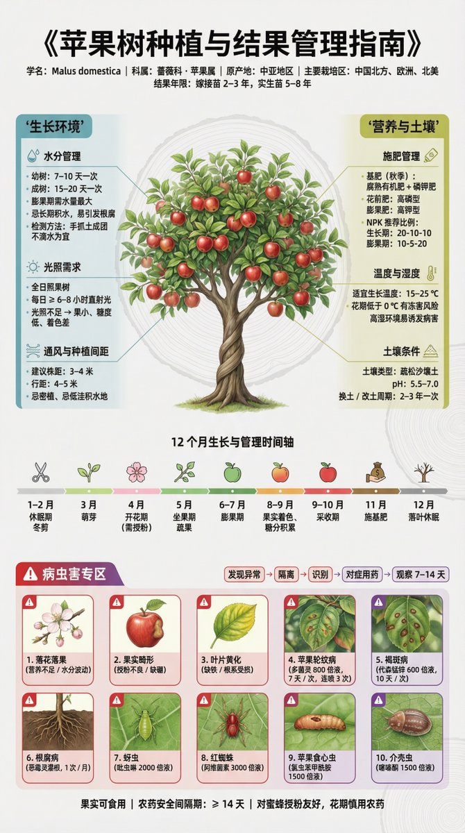

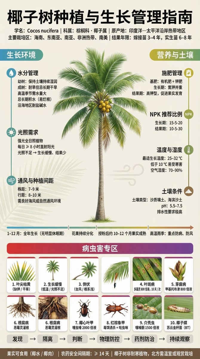

The centerpiece features a realistic, almost hyper-detailed depiction of a mature fruit tree branch, with crisp leaf veins, bark texture, and ripe fruits rendered in ultra-high 4K detail. The background is kept very light—think soft cream with subtle geometric agricultural patterns, like leaf vein structures and tree rings, barely visible at low opacity to keep the focus on the data and visuals.
Why This Approach Worked
The layout is thoughtfully divided to balance dense scientific data with readability. On the left, water and light management details are displayed in calming blue-green tones, including watering schedules for different tree stages and sunlight requirements. The right panel uses yellow-green hues to explain fertilization cycles, soil pH, and temperature tolerances.
Midway through, a horizontal timeline illustrates the 12-month growth and care cycle with simple icons marking key phases like pruning, flowering, and harvesting. This visual timeline helps translate complex horticulture timing into an easy-to-follow guide.
The Challenge of Pest and Disease Sections
The bottom 30% is dedicated to pest and disease identification, highlighted in red-purple to signal caution. Each of the 10 common issues is represented with symptom close-ups, clear identification tips, and precise treatment protocols including pesticide names, dilution ratios, and application frequency — all based on accurate, verifiable agricultural sources. This part took the most research but was crucial for the guide’s practical value.
Design Details That Elevate the Poster
- Fonts: A mix of Source Han Sans and Source Han Serif to ensure crisp, clear Chinese text rendering.
- Color coding: blues for water, yellows for light, greens for nutrition, reds and purples for pests and diseases — this coding guides the eye intuitively.
- Line work: Super fine radial connectors from the fruit tree illustration to the data points keep the layout clean and cohesive.
- Spacing: About 25% white space balances the high info density without overwhelming the viewer.
- Photography style: Soft, natural lighting and medium-large depth of field give the tree specimen a lifelike feel.
Creating this poster was a deep dive into both visual storytelling and scientific accuracy. It’s a perfect example of how AI image generators can be harnessed for professional agricultural communication. For creators wanting to try similar projects, focusing on accurate prompt adjustments and including verified data sources is key to avoid common mistakes like generic visuals or outdated info.
You can find the full prompt here: ✨Prompt✨
For more inspiration, check out these resources on text to image technology and how to use AI as an AI art creator for detailed, data-driven visuals.