From Concept to Canvas: My Experience with the Nano Banana Pro Illustrator Board
When I first encountered the idea of a Nano Banana Pro Illustrator Presentation Board, I was intrigued by the promise of seamlessly blending technical precision with artistic expression. As someone who frequently uses AI for visual creation, I wanted to see how this setup could elevate architectural presentations, especially focusing on a modern residence.
The board is cleverly organized to guide the viewer’s eye from left to right: starting with crisp black and white 2D drawings including the site plan and floor plans on the left, moving through detailed elevations and cross-sections in the center, and culminating in a photorealistic 3D render capturing the residence at sunset. This natural progression felt intuitive, almost like a story unfolding visually.

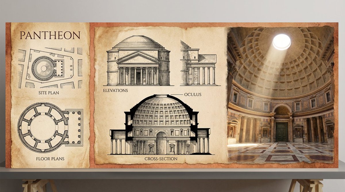


The unified aesthetic was a particular highlight. The linework style was clean and precise—think fine ink pens with a hint of hand-drawn warmth—paired with subtle textures reminiscent of concrete and wood grain. It was fascinating to see how the technical drawing tones, mostly monochrome with delicate shading, transitioned smoothly into a warm, golden-hour color palette in the render. This contrast not only emphasized the architectural elements but also injected life and atmosphere into the design.
One challenge I faced was balancing the technical accuracy of the drawings with the emotional impact of the render. Initially, the floor plans felt too clinical compared to the vibrant 3D image. Adjusting the line weights and incorporating soft shadows across the 2D elements helped bridge this gap, creating a cohesive flow from one side of the board to the other.
Using the Nano Banana Pro approach pushed me to rethink how I present architectural projects. It’s not just about showcasing plans but telling a visual story that resonates on multiple levels—technical, aesthetic, and emotional.
For fellow creators diving into architectural visualization or even other industries using AI image generator tools, the key takeaway is to experiment with prompt adjustments that balance technical detail and artistic flair. Avoid common prompt mistakes like overloading the description, which can dilute focus. Instead, strategically layer your prompts to guide the AI from precise linework to rich material textures and dynamic lighting.
Why this matters
Presentation boards like this elevate how clients and collaborators perceive a project, making complex data approachable and inspiring.
You can find the full prompt here: ✨Prompt✨
For more inspiration, check out how text to image AI art creators leverage similar techniques to blend styles and moods. Whether you’re an architectural illustrator or a creative in a different field, these insights can help refine your image generation process and create visuals that truly captivate.