Why I Tried Text Animation on Gemini Nano Banana 3.0
As a content creator fascinated by mixing analog textures with digital art, I was eager to try text animation on the Gemini Nano Banana 3.0. The prompt called for preserving full likeness while transforming the image into a high-energy doodle art piece on lined notebook paper. I wanted to see how layering ballpoint pen lines, neon markers, and ink textures could bring out a chaotic yet playful vibe.


You can find the full prompt here: ✨Prompt✨
The Visual Experience
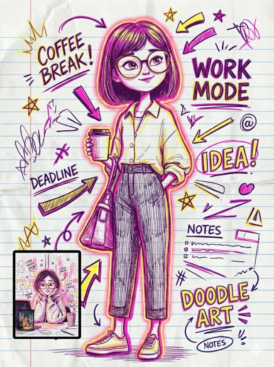
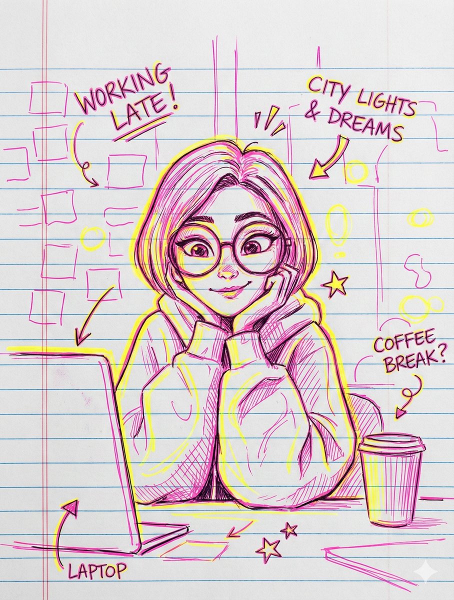
The final piece bursts with dense, spontaneous energy. Thick-thin line variations and messy strokes create a freestyle sketch look, while dynamic hatch shading adds depth. The lined paper substrate isn’t just a background—it feels tactile, with realistic ink absorption, subtle wrinkles, and even stained edges that make the digital art feel tangible.
What really stands out are the overlapping annotations: speech bubbles, lightning bolts, music notes, and quirky mini self-caricatures that dance around the portrait framed by a bold border. Neon pinks, electric blues, and bold cyan pop vividly against the paper, especially in the variant with neon highlights and graffiti-style outlines. The handwritten comic notes and sound effects like "ZAP!" and "WHOOSH!" add a playful, almost nostalgic comic book feel.
Practical Insights & Prompt Tips
- Preserving the likeness in an img2img task is key. Maintaining the subject’s facial features while layering chaotic doodles keeps the portrait recognizable amidst the energy.
- Using a lined notebook paper substrate adds an authentic analog texture that grounds the neon and ink effects.
- Balancing thick and thin pen strokes with layered ink absorption creates a believable hand-drawn feel despite the digital process.
- Playing with color palettes—from bold cyan and magenta to neon pink and yellow—can drastically change the artwork’s mood from stylish pop to expressive highlighter aesthetics.
- Don’t shy away from 'messy' elements like scribbles, arrows, and checkboxes; they amplify the spontaneous vibe and make the piece feel alive.
One mistake I initially made was underestimating the importance of lighting—bold outer glows and vibrant contrast truly make the neon colors jump off the page.
For anyone working on similar projects, combining text animation with layered analog textures is a fantastic way to push creative boundaries and produce visually rich, emotionally charged content.
Explore More
If you’re curious about text to image techniques or want to dive deeper into AI art creators, check out these resources: