Breaking Down the Perfect Taco Visually
Recently, I dove into creating a visually precise exploded view of a taco using AI tools like Nano banana pro and Kling AI. The goal was to clearly separate and showcase five core ingredients in a clean, commercial recipe-style infographic that feels both instructional and minimal.
The challenge was to arrange the ingredients vertically from top to bottom with exact spacing and alignment, ensuring each layer stands out without clutter. The ingredients included fresh tomato salsa (40 g), shredded cheddar cheese (30 g), grilled chicken pieces (80 g), crisp lettuce (25 g), and a soft wheat taco tortilla (60 g) as the base.
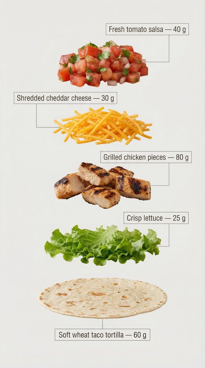
The design called for clear, infographic-style annotations next to each ingredient. I chose a clean sans-serif font with medium weight, placing each label inside minimal frames connected by thin lines pointing directly to the ingredient. This approach enhanced readability and maintained a modern, commercial look perfect for marketing or recipe breakdowns.
Using a light, neutral background was crucial to optimize text clarity and keep the overall feel minimal and professional. The vertical layout mimics a sleek recipe card, making it easy to follow visually while emphasizing the exact weight of each component.
This project was a great exercise in balancing visual appeal with instructional clarity. It reinforced how small prompt adjustments—like specifying font style, annotation placement, and spacing—can elevate the quality of AI-generated images dramatically.
For anyone working with text to image AI, I recommend focusing on prompt details around layout and annotation style. Avoiding common mistakes like overcrowding or decorative excess helps keep the infographic clean and effective.
You can find the full prompt here: ✨Prompt✨
For more inspiration and guidance on image generation, check out these resources: